
Prepared from Natural Earth data
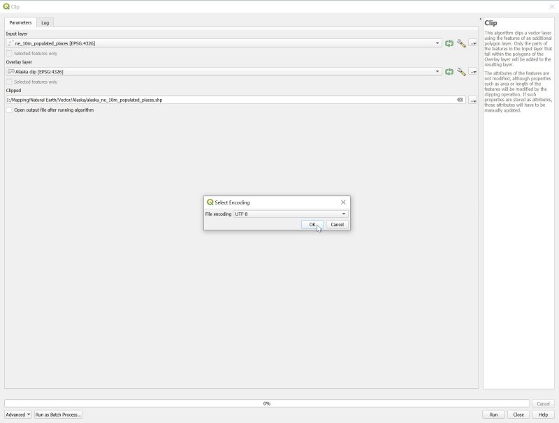
By way of tidying up a thread that was left dangling when I took my little blog sabbatical last year, this is the concluding instalment of my development of a map of Alaska in QGIS. By the end of my last post on this topic, I’d added roads, railways and settlements to my map. To the one above, I’ve now added some maritime features: the ocean border between Russia and Alaska (from Natural Earth’s Cultural Vectors page, the “Admin 0 – Boundary Lines” section, listed as “maritime indicators”); and some labels for major bodies of water (from Physical Vectors, “Physical Labels”, “marine areas”).
Each of these I downloaded, unzipped, and clipped down to my area of interest as I’ve described in previous posts in this series. This is particularly important for the “marine areas” dataset, otherwise the Southern Ocean polygon ends up sitting on top of Russia. Because I’m only interested in labelling the largest bodies of water, I’ve set up rule-based labelling (as described in previous posts) to display only names that meet the criterion
“scalerank” < 4
Now to add some additional information, from sources outside Natural Earth.
Firstly, this map is full of islands, but none of them have names. Fortunately, the United States Geological Survey has compiled a dataset of the world’s islands, from the largest to some really tiny ones, called Global Islands. Unfortunately, the dataset is so huge it’s unwieldy for my purposes—every island has its own polygon shapefile, mapping its coast, which I don’t need for this project. It’s also slightly awkward to import the dataset into QGIS. So what I’ve done is I’ve extracted just the information I need to provide labels (three different name categories), and to filter the labels according to the size of each island (an integer area in square kilometres). And I’ve extracted the centroids for each of the island coastline polygons, so I can associate each label with the centre of its island. (To that end, I’ve done a little light editing along the 180° meridian, where islands are split into two parts, each with its own label. I’ve consolidated the labels and moved them to the overall centroid.) I’ve also used only the USGS “Big Islands” dataset, which covers everything larger than a square kilometre. You can download the resulting abridged file here. It’s called USGS-Big-Islands-centroids-abridged.zip—unzip it and clip as usual.
As I said, it contains three categories of names—those used by the USGS, those used by the World Conservation Monitoring Centre, and “local names”. It turns out there are only three categories of islands in the file—those with a USGS name, those with non-USGS name, but a WCMC name, and those without any names at all—there are no instance in which only a local name is listed. You’ll find an image called alaska.png in my zip file, which shows the distribution of those categories, coded green, amber and red respectively. (I retained the entirely unnamed data points to allow manual editing of islands with names that have been omitted from the dataset.)

Processing this gets a bit messy. The USGS names unfortunately include “UNNAMED” and “NULL”, and a number of islands in the Mackenzie Delta are unhelpfully named “Mackenzie Delta”; likewise for the Yukon Delta. A number of small islands fringing larger islands are confusingly named for the parent island. I also want to give the labels for large islands more salience than for smaller islands, and to exclude the names of islands that are too small for the scale of my map. After some experimentation, I came up with the following two categories for rule-based labelling:
Large:
“Area_Geo_I”>=9000 AND NOT(“Name_USGSO” IS NULL OR “Name_USGSO”=’UNNAMED’ OR “Name_USGSO” =’Mackenzie Delta’)
Medium:
“Area_Geo_I”>200 and “Area_Geo_I”<9000 AND NOT(“Name_USGSO” IS NULL OR “Name_USGSO”=’UNNAMED’ OR “Name_USGSO” =’Mackenzie Delta’ OR “Name_USGSO” =’Yukon Delta’)
The large islands have areas greater than 9000 square kilometres, while the medium-sized islands are 200-9000 square kilometres in extent. The rest of the rules exclude the not-very-useful “names”. By assigning different sizes of text to these two categories, and using the field Name_USGSO for my labels, I get this:

Prepared from Natural Earth data and the USGS Global Islands dataset
That’s nice enough. The larger islands, like Kodiak and Vancouver, stand out in larger type than the smaller islands. I’ve also assigned these labels a higher priority (in the Placement section of the Edit Rule dialogue), so that they don’t get crowded out and disappear among the smaller labels.
I’ve differentiated the island labels from other labels by giving them a white semitransparent “buffer” (defined in the Buffer section of Edit Rule). But I’d also like the label to specifically indicate that it’s marking an island. One of the frustrations of the USGS dataset is that some Russian island names are labelled as such—like Ostrov Mednyy at the left edge of the map, ostrov being the Russian word for “island”; but the English labels are unadorned placenames. So I’d like to append “I.”, for island, to these labels, while leaving names that start with “Ostrov” unchanged. I can set this up by replacing the simple Name_USGSO label with something more complicated and conditional:
IF (LEFT(“Name_USGSO”,6) = ‘Ostrov’, “Name_USGSO”, “Name_USGSO” || ‘ I.’)
This checks to see if the leftmost six letters of Name_USGSO are “Ostrov”. If so, it just prints the name as given; if not, it appends ” I.” to the name. I described in detail how to set up this sort of rule-based label, and the use of the string concatenation operator “||”, in my previous post.
And here’s the result:

Prepared from Natural Earth data and the USGS Global Islands dataset
Next, I’d like to add some sea ice to Arctic Ocean. I want to roughly depict the state of the sea ice along the north coast of Alaska in the autumn of 1933. So this is more of an artist’s impression, but it’s nice to have some real-world data, which can be obtained from the National Snow and Ice Data Center. Shapefiles for monthly sea-ice extent in the northern hemisphere can be downloaded here, and after a little experimentation I settle on importing the polygon for October 2004. Here it is:

Prepared from Natural Earth data, the USGS Global Islands dataset, and sea ice data from the National Snow and Ice Data Center
QGIS has automatically shifted the original data to the default “Alaska Albers” projection for this project. But it looks a bit ragged, doesn’t it? Clearly, the sampled areas are fairly large.
There are a number of ways of smoothing this appearance, and I used a fairly rough-and-ready approach, through Vector>Geoprocessing Tools>Buffer… First, I created a buffer of 50 kilometres around the polar ice polygon:

Apart from setting the buffer size, I’ve also ticked “Dissolve result”, which means that some of the individual squares around Banks and Victoria Island, for instance, will merge together as they expand, rather than overlapping. This creates a temporary layer called “Buffer”, which spills dramatically over the land. Then I created a negative buffer around this new temporary layer, setting the buffer size to -45 kilometres. This produces a much smoother appearance, but the ice is still overlapping the land a little:

Prepared from Natural Earth data, the USGS Global Islands dataset, and sea ice data from the National Snow and Ice Data Center
To deal with that problem, I just need to clip the ice layer using the ocean layer, via Vector>Geoprocessing Tools>Clip…
But first, I go to the “Layers” window, right-click on this newly generated “Buffer” layer, and select Export>Save Features As…, so that I can save it in the Alaska Albers projection to match the rest of the project:

(Notice that I’ve set the saved CRS to “Project CRS” on the drop-down menu.)
If you’ve been working though these posts in numerical order, you’ll have retained the full Natural Earth ocean shapefile, ne_10m_ocean.shp. If not, you can download it here. This is what I can use to clip my smoothed ice cap polygon so that it conforms to the coastline:

“Input layer” is my seaice_unclipped.shp file, previously saved, and for “Overlay layer” I’ve used the little […] button to navigate to ne_10m_ocean.shp on my hard drive. Running this produces a nice, neat new temporary layer which conforms perfectly to the coastline.

Prepared from Natural Earth data, the USGS Global Islands dataset, and sea ice data from the National Snow and Ice Data Center
I can tart this up by double-clicking on it in the “Layers” window to open Layer Properties, and then in Symbology setting “Fill color” to white and “Stroke color” transparent, before saving it to disk with an appropriate name. The final tweak is to move its position in the “Layers” window so that it sits just below the coastline layer, which produces a nice clear line of demarcation between ice and land.

Prepared from Natural Earth data, the USGS Global Islands dataset, and sea ice data from the National Snow and Ice Data Center
For final detailing, there are a few locations I want to add by hand—settlements and small islands particularly relevant to my 1930s setting. I can do this by creating a little comma-delimited text file. Here are the first few lines of that:
No., Name, Lat, Lon,Type
1,Herschel I.,69.589722,-139.099167,Island
2,Barter I.,70.118056,-143.666667,Island
3,Aklavik,68.220278,-135.011667,Settlement
And here’s how it looks when I load it using Layer>Add Layer>Add Delimited Text Layer…:

QGIS automatically detects that my “Lat” and Lon” fields refer to Y (latitude) and X (longitude), though I can change these values if QGIS gets it wrong. Having loaded the layer, I can then use the “Name” field for labelling, and the “Type” field for formatting.
Finally, I want to overlay some lines on the map—specifically the route taken by Isobel Wylie Hutchison during her Alaska-Yukon travels of 1933-34, which I’ve written about before.
I can do this using the Annotations toolbar, which looks like this:

If it’s not visible among the many toolbars at the top of the map, go to View>Toolbars and put a checkmark in the box next to “Annotations Toolbar”.
I start by opening a new layer, by clicking on the leftmost icon and then New Annotation Layer.

Then I start to lines by clicking on the Create Line Annotation icon.

This turns the cursor into a little gunsight, and I draw my lines a point at a time by left-clicking my way across the map. When I finish a line with a right-click, a window opens which lets me configure the line style. And repeat as necessary …
Here’s the final result, showing the colour-coded stages of Isobel Wylie Hutchison’s journey.

Prepared from Natural Earth data, the USGS Global Islands dataset, and sea ice data from the National Snow and Ice Data Center
And that’s how I built the map that appears at the end of my post about her account of her travels, North to the Rime-Ringed Sun (1934).
or


 We can take a look at the content of this layer by double-clicking on its name to bring up the Layer Properties dialogue and looking at “Source Fields”:


